

Today we have an unparalleled level of technology at our disposal for building and delivering a home for a product or project online. WordPress has become a primary platform for delivering a wide range of functionality, but sadly, no matter how great the tech is, the way a website is designed, structured, and presented can often leave users confused.
As a community strategy consultant, I see this happen all the time. Companies and projects spend enormous amounts of time and money in attracting people to their website and then when they arrive, the experience of understanding and participating is confusing, complex, and at times frustrating.
Today I want to share some recommendations for how you optimize your website to resolve these issues.
Designing an On-Ramp
Fundamentally, websites should (a) deliver information we want the reader to consume, and (b) encourage user behavior we want to see. For example, we might want to show someone our product and then have them sign up for a demo. Or, we might want someone to read and comment on our blog.
First, sit down and think of these desired core outcomes. Now, for each, map out an on-ramp that breaks down how someone would get there. For example, for someone to sign up for a SaaS service, this might be the on-ramp:
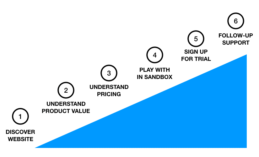

Breaking this down now gives us a structure to figure out (a) how to easily serve each step, and (b) have a clear link from one step to another.
For example, with our on-ramp above, for Step 2 (“Understand Product Value”), we could first serve this step with a webpage with a feature breakdown, provide case studies, and comparison matrixes for why our product is more valuable than others. Now, to ensure there is a clear connection from Step 2 to Step 3 (“Understand Pricing”), this could be a link to a list of pricing, how this product offers more value per dollar spent, or some other way of providing this information easily.
The key here is designing a logical process, breaking it into the on-ramp, and serving each step and how people transition up the steps. Importantly, when assessing the success of your on-ramp, it should be:
- Simple to navigate – each step is simple, well understood, and easy to keep progressing from step to step.
- Quick to experience – going from Step 1 to Step 6 should be as fast and efficient as possible. Elegance and efficiency is in itself is a powerful force in encouraging people to participate.
- Designed for failure – don’t just design for how people successfully move up the on-ramp, but also for when they get stuck. How do they get unstuck and keep progressing?
I am a big fan of having simple strategic tools to help us to make the right kind of choices. I designed this on-ramp approach a number of years ago, and I have found it to be an effective tool in designing simple methods of getting people to participate across a range of different domains.
The Checklist
So, the on-ramp above provides us with a structure, but now I want to provide a quick checklist of five important things to consider when building your on-ramp with a specific focus on your website.


1. Design for laziness… and SEO
Always remember that people are often pretty lazy. While you may put an elegant structure on your website to help people find things, your audience will always be looking for a short cut.
As an example, a lot of open source projects have a Documentation section, with a carefully curated and structured list of documentation and guidance. Here’s the thing: most people will either lose patience trying to find the right information before they have clicked three times on your site, or they will simply type their question into Google.
As such, don’t obsess too much about having a perfect (and comprehensive) site structure. Focus on how quickly people can surface information from the front page and ensure your site is optimized for SEO to ensure they can find individual pages from Google.
2. Have a clear and simple navigation
It sounds basic, but having a clear menu on your site is key. Importantly, this doesn’t mean having everything available on that menu, and be especially careful with multi-level menus.
Instead of thinking about things from a functionality perspective, think about the use cases and the personas of the people visiting. For example, many open source websites have two core audiences: users and developers. Some sites break the overall site up into two sections, one for each audience, and then drill down from there.
Think carefully about this: in the same way we want our content to be simple and easy to understand, our navigation also needs to be simple.
3. Deliver value for users without signing up
Many clients I work with have a product or a service they want people to sign up for. For example, one client has a API technology and I strongly encouraged them to ensure that users can play with and derive value from the technology without signing up.
This doesn’t just mean being able to play with the tech, but also being able to read documentation, see examples, engage with the community and more. Importantly, it is these supporting resources (e.g. documentation) that people use to assess a product: don’t hide it behind a login screen.
Focus on the function and purpose of the sign-up component, and ensure the audience can experience value before you get there. Apart from increasing the likelihood that people will try out your product/project (most people hate signing up), you will also increase the number of sign-ups if they have already experienced value.
4. Have a single call to action on each page
When designing each page on your site, you should focus on two key things:
- What are the three key messages I want to deliver on this page to the reader?
- What is the call to action I am asking the reader to respond to?
The call to action piece is critical. This may be signing up, subscribing to a blog, asking a question, or something else. Don’t overwhelm your users with too many calls to action: focus on one on each page and make it simple to engage with and with limited consequences.
5. Test extensively with real world users
If there is one thing I have learned about technology throughout my career is that our presumption of the best solution and the actual best solution are often quite different. The reason? People who use our things often use them in ways we didn’t anticipate.
The solution to this is to test our hypothesis regularly. Fortunately, there are two things we can focus on here:
- A/B Testing – this is where we configure our site to deliver one experience to some users and another to others. We then compare the results. There are many themes that include A/B testing (such as the excellent Divi theme), and a number of WordPress plugins that make this simple too. A/B testing is phenomenally valuable.
- Measuring Event Triggers – Google have a tremendous product called Google Tag Manager that makes it simple to add triggers inside a webpage that fire in different circumstances (e.g. a trigger is fired if someone fills in a form). This provides a good way to measure specific types of behavior to see if they match your idea of how people are using the site.
In conclusion, in order to optimize our websites for participation we need to (1) design the optimal on-ramp, (2) ensure we deliver a simple and efficient user experience, and (3) test our assumptions with testing. If we do this well, we will get the best results for the content and experiences we deliver. Good luck!