
There are now more than one million podcasts out in the world, with a combined 30 million episodes between them. And while lots of work goes into making a podcast, from creating the content to promoting the show, there’s one area that often goes overlooked: podcast art.
Much like a book cover, some people will unfortunately judge your show by its artwork. If it catches their eye, they’ll be more likely to click through and read the show’s description, and then they’ll get hooked based on the content.
Especially if you don’t yet have a sizable audience, your podcast artwork will play a major part in the success of your show. After all, if someone’s browsing through a directory like Podchaser or Stitcher, you’re competing against up to hundreds of thousands of other shows in your space. You’re even competing with other content in people’s social media feeds.
Yes, some massively successful shows have changed their artwork down the road; for example, My Brother, My Brother and Me had the same cover for 505 episodes, only switching to new artwork after celebrating 10 years of their show. But they were also buoyed by an incredibly loyal fanbase that promoted their podcast via word of mouth.
While you’re still building up your show’s buzz, think of what works from a visual perspective. Not sure where to start? We asked graphic designers, photographers, and animators to share their favorite podcast artwork and what they like about them. Hopefully, it’ll get your creativity flowing.
Overtime by Dribbble

“I listen to a lot of podcasts, mostly on the topics of soccer and design. My all-time favorite in terms of artwork has to be the Overtime podcast by Dribbble. Meg Lewis, who is an all-around delightful human being, creates personalized art for each episode released. Meg’s style is bold, colorful and playful so the art always catches my attention. The title of the episode is typically featured within the art, but it’s arranged or styled in a creative way that makes me analyze the work more.”
—Ryan Riggins, Photographer and Designer
Bite by Mother Jones

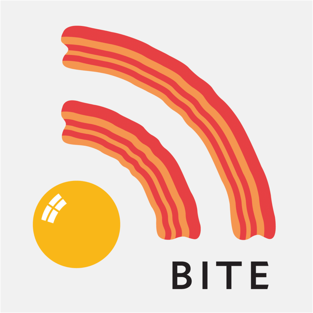
“This podcast from Mother Jones is very clever, using bacon and an egg to replicate the RSS logo. It’s beautifully simple and makes you hungry. Well, at least it made me hungry! My favorite concept in design is KISS—keep it simple, stupid—and this is the ideal design to understand that concept. Who doesn’t want to take a ‘bite’ out of bacon and eggs? It does the job of making you want to listen to the next bite, whatever it is.”
—Stephanie Castillo, Freelance Artist and Graphic Designer
NPR Podcasts, including Ask Me Another and The StoryCorps Podcast

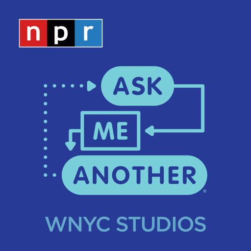

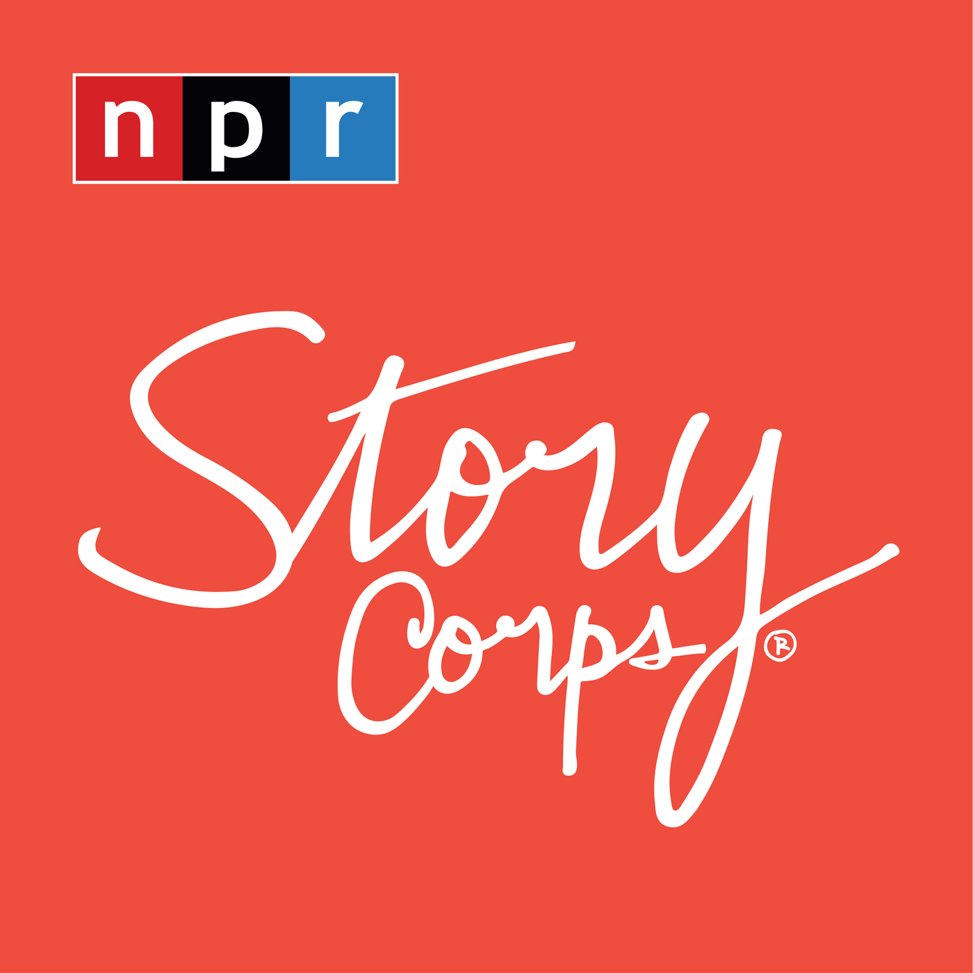
“A lot of the NPR podcast designs! I like podcast artwork that uses a simple layout with creative typography and color to express the topic and tone of the show. Just from looking at the artwork and the fonts they use, I get a sense for the tone and positioning the show will take.”
—Stephen Barkan, Designer at Doist
Crooked Media Podcasts like Pod Save America


“I’m going to cheat a little here, and say I really love the podcast art for the Crooked Media Network. Each show has a simple illustration on the cover, perfectly conveying the tone and substance of the show. Not only that, but they change up the artwork to match whatever the prevailing topic might be at the moment. For example, their main show, Pod Save America, currently features an American flag in an hourglass, to signify the short amount of time we have left before the November election. It’s thoughtful, simple, and well-executed.”
—Jess Kennedy, Marketing & Design Consultant
DnDnD
“The cover is super awesome. It pulls in a ton of elements associated with DnD and probably some Easter eggs from the show itself. This cover is a feast of visual goodies, but it manages to completely stand out even at postage stamp size, due to the title being high-contrast and beautifully legible against the background.”
—Bryan Sanders, Freelance Motion Designer and Animator
Last Podcast on the Left and My Favorite Murder


“You can tell both of these podcasts have gone out of their way to customize their brand and hire an actual artist, which makes a huge difference. They both have really creative fan bases as well. It’s super interesting to compare the fan art and see how each podcast acknowledges it. I love looking at reposts from Ben Kissel’s Instagram. He totally goes out of his way to share everything all of the fans make.”
—Braighlee Rainey, Graphic Designer
Invisibilia


“My favorite podcast artwork currently is Invisibilia. The fun typography plays on the podcast’s subject matter: all the invisible forces in our lives. The overlapping letters and jumbled format still reads as a legible word, which is often lost in typographic works.”
—Savannah Lane Pryfogle, Brand Designer & Strategist
Just a Tip

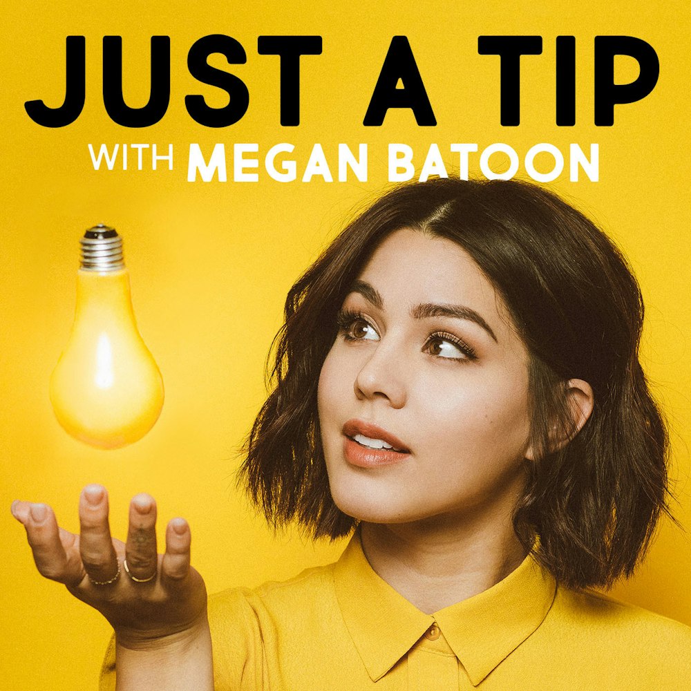
“This podcast by Megan Batoon has one of my favorite podcast artworks. As a photographer, I’m very visual. Not only is the photo pleasing with her stunning face, but it explains exactly what I’m getting myself into. Explaining what your entire podcast is with only a small square is super difficult, but Megan nails it!”
—Bianca Delmar, Autofotive
Stuff You Should Know

“This podcast art is very clinical and seemingly straight from a manual, which communicates it’s going to be an informative podcast. It’s nothing wild or fancy, which is what the show is like. The show pairs its theme and artwork really nicely.”
—Ari Flesch, 3D Animator
Five More Tips for Your Podcast Artwork
Now that you’ve seen some of the favorites of professional visual artists, you’re on your way to creating something spectacular. Remember to keep these five tips in mind as you finalize your artwork.
Make it Legible
Go through any podcast directory—let’s use comedy podcasts on TuneIn for this exercise—and browse through the podcast artwork on there. What stands out to you? Which podcasts make you want to click through to learn more and listen?
This is the same method many listeners use to choose a new podcast to try. And one surefire way to have a listener skip right over you is by having an illegible podcast title. While several directories do include the name of a podcast next to the artwork, almost everyone’s eyes will go to the artwork first. If they have to struggle to read your title, they may not give you a second chance.
To help keep your title legible, don’t use more than two different fonts or have words bump up too closely to the edge of the frame. You also should use a minimal amount of words; often, simply the title of your show—even omitting the word “podcast” if necessary—will suffice.
Choose Bold Colors
Something else you may have noticed while browsing a podcast directory: the most eye-catching podcasts all use bold or contrasting colors. You’ll likely only get a second or two to grab someone’s attention, and color scheme plays a major part in that.
Bold doesn’t mean you have to channel an Elton John outfit, though if that fits your brand, go right ahead. You can also mix colors that contrast with each other by pairing them in unique ways. Even a black and gray combo comes across as bold if used properly.
Keep it Square
The minimum size for uploading to Apple Podcasts is 1400 x 1400 pixels. Other podcast directories have recommended sizes as well but there’s one consistent: it’s always a square. Creating your podcast artwork at 3000 x 3000 pixels, 72 dpi, RGB colors, and saved as a .jpeg file will offer you the most extensive and flexible options.
You can design more vertical graphics for Instagram or horizontal ones for Twitter or Facebook to help promote your podcast across social media. However, for the artwork itself, anything that’s not a square will get clipped or the podcast directory won’t accept it at all.
Think From a Mobile Perspective
Nearly seven in 10 podcast listeners tune into shows on their phones. While flashy artwork might look great on your desktop computer, you risk alienating a large percentage of your audience if that artwork becomes unreadable on your phone.
Depending on the platform, your podcast cover can be shrunk all the way down to 30 x 30 pixels. Make sure you test view it at all different sizes, especially on your phone.
Communicate What Your Podcast is About
As you’re developing your artwork, you’ll want to discover the answer to this question: What is my podcast all about?
You won’t know how every conversation will go, but think about the tone of your show. It may be interview-style, educational, quirky, over the top, or straightforward but it’s distinctly yours, and your artwork should reflect that.
Is your show an extension of your company? You don’t need to name your show after the business, but the logo should be somewhere on the artwork. That way, it’s recognizable to your current customers and can help establish a brand identity.
Is the show all about you? Your face can help draw in people within your network while also putting a face to your name for newer listeners.
When you’ve identified your show’s style, it’s a lot easier to develop artwork that fits into that theme.
Do you have a favorite podcast artwork? Let us know in the comments below or give us a shout on Facebook, Twitter and LinkedIn.
Photo by Elice Moore on Unsplash