
According to the Baynard Institute, almost 70% of consumers will browse e-commerce websites, add products to their shopping carts, and then abandon their orders. Surprise costs, slow or complicated checkout processes, and limited buying options can all contribute to lost sales. Luckily, there are various steps you can take to simplify the e-commerce experience and increase your conversions.
In this article, we’ll discuss the importance of creating a simple checkout process. Then, we’ll show you how to create a flawless checkout experience. Let’s get started!
Why Creating a Simple Checkout Process Is Important
Forty-eight percent of online shoppers say that extra costs such as shipping fees are the main reason why they don’t follow through with their purchase. However, hidden fees are just one aspect of the buying process that can have a direct effect on your sales rates.
Another is an arduous checkout experience. If customers have to jump through hoops to get from start to finish, they’ll probably stop halfway. Every obstacle is another lost sale for your e-commerce business.
When a shopper leaves items hovering in their carts, this is known as cart abandonment. This is often the result of high shipping costs, slow delivery times, or being forced to create an account.
Only so many of these factors are within your control. One thing that is within your control is the checkout process, or the series of actions that begins with buyers browsing products and ends with completing an order.
The best way to optimize this experience is to eliminate as many obstacles as possible. Simplifying the checkout process can help you convert possible buyers into paying customers. These users may return to your store in the future, and may even recommend your business to friends and family.
5 Ways to Create a Seamless E-Commerce Checkout Experience
The shopping journey is one aspect of your site’s User Experience (UX) that you can customize in order to decrease cart abandonment. In fact, there are several things you can do to turn a visitor into a buyer.
Let’s take a look at five tips on how to improve your site’s checkout process.
1. Provide Multiple Payment Methods
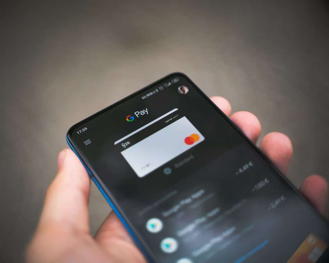
More payment options for consumers means more ways to buy your product. If potential buyers have a preferred way of payment that isn’t available on your site, they will be less likely to follow through to checkout. Giving only one option will limit the customer’s choice.
You can start with the most popular payment methods, such as PayPal, and expand from there:


Options such as bank transfers, ApplePay, and even cryptocurrency will open up access to more customers. While including more than one payment method can be a bit more costly for your business upfront, it will provide more flexibility for your buyers. This could help you make more sales in the long run.
2. Ensure That Your Checkout is Mobile-Friendly
There are several ways to optimize your business site to drive more traffic. This includes making sure that it works well on different devices, including mobile phones.
According to Oberlo, almost three out of every four dollars spent online is done on a mobile device. This suggests that a large part of your customer base is shopping on their smartphones or tablets:

If you haven’t enabled mobile-friendliness on your checkout page, you risk losing a big portion of online buyers. When setting up your layout, you’ll want to make sure that your Call To Action (CTA) is responsive on both mobile and desktop devices. You’ll also want to check that your checkout button is functioning properly. A responsive checkout process will open up your store to mobile shoppers.
3. Create One-Page Checkouts
If your customers have to click through multiple pages to buy a product, they may get a bit discouraged or frustrated by the long process. Therefore, you may want to consider creating a one-page checkout. This can lead to a smoother shopping experience, which may encourage buyers to complete their orders.
With one-page checkouts, users have all the necessary data—payment, shipping details, and order information—right in front of their eyes:

Users aren’t left guessing what the shipping costs might be or whether they’ll have to create an account. Ultimately, a one-page checkout improves your UX and condenses all steps into one final move —buying your product!
4. Allow Guest Checkout
Having users create an account increases your chance of gaining a recurring customer. However, it can also deter a potential buyer due to all the extra steps of filling out forms and entering personal information.
Therefore, you might want to add a “guest checkout” option. This ways, shoppers can choose to place their order without having to fill out a form:
This also shows shoppers that you respect their privacy, because you’re not obliging them to provide you with personal data. If there’s less upfront hassle, you increase the chance that your buyers will come back and create an account if they like your product.
5. Use “Buy Now” Buttons
Any CTA on your website should be clear and actionable. This includes your “buy now” buttons.
A “buy now” button offers a fast and easy solution for customers, acting as a shortcut to checkout (instead of placing items in their carts for later):
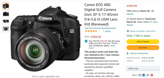
Try using a “buy now” button in emails, blog posts, and directly on your site. You can place it in a prominent location and use a strong color such as red or orange for added impact.
Implementing a “buy now” button condenses the checkout process, cutting back the steps between browsing and buying. This can help you increase your conversion rate.
Conclusion
Cart abandonment is a tough problem to solve. However, simplifying the buying process will have you well on your way to creating a seamless checkout experience from start to finish. By providing multiple payment options, allowing guest checkouts, and using clear “buy now” buttons, you could help turn visitors into paying customers.
Do you have any questions on how to create a seamless checkout experience? Let us know in the comments section below!
Photo by Mika Baumeister