
There’s art that pulls you in and art that makes you say, with the utmost confidence, my 3-year-old could do that! Unfortunately you could say that about some websites, too. (But I won’t list them here.)
Web design is an art, and if it’s not compelling, then your brand suffers. In other words, the design needs to fit the brand and vice versa. It’s not surprising, then, that there’s a whole psychology behind web design, from the user experience to the overall look and feel of your website. But luckily you don’t need to have a PhD in Behavioral Science to figure this out. You just have to know your audience.
Easier said than done? That depends on your approach. One of the core fundamentals of branding is researching and knowing your audience. The psychology of web design introduces yet another layer to the customer experience, one which will make your job easier, if done right.
Can’t Stop the Feeling
At the heart of successful web design is emotion which, according to cognitive research, is a major factor in driving the decisions we make. The way a person feels about your brand manifests itself in the user experience, buyer journey and consumer loyalty. The need to humanize your brand is key in engaging your audience on that emotional level, and web design plays a huge role in doing just that.
“We humans think of ourselves as rational creatures who make choices based on a conscious and logical thought process,” wrote David Wharram, CEO of Coast Digital, in a guest piece for Velocitize. “But neuroscience tells us that in truth we make a lot of our decisions based on intuition; that ‘gut feeling’ of ours.”
Viewing your website through a so-called cognitive landscape provides an innovative lens into the many elements of web design. According to Trajectory, a digital marketing and web design company, successful cognitive landscaping involves intuitive page layout and ease of navigation; coherence; engaging content and messaging; and effective conversion techniques or calls to action.
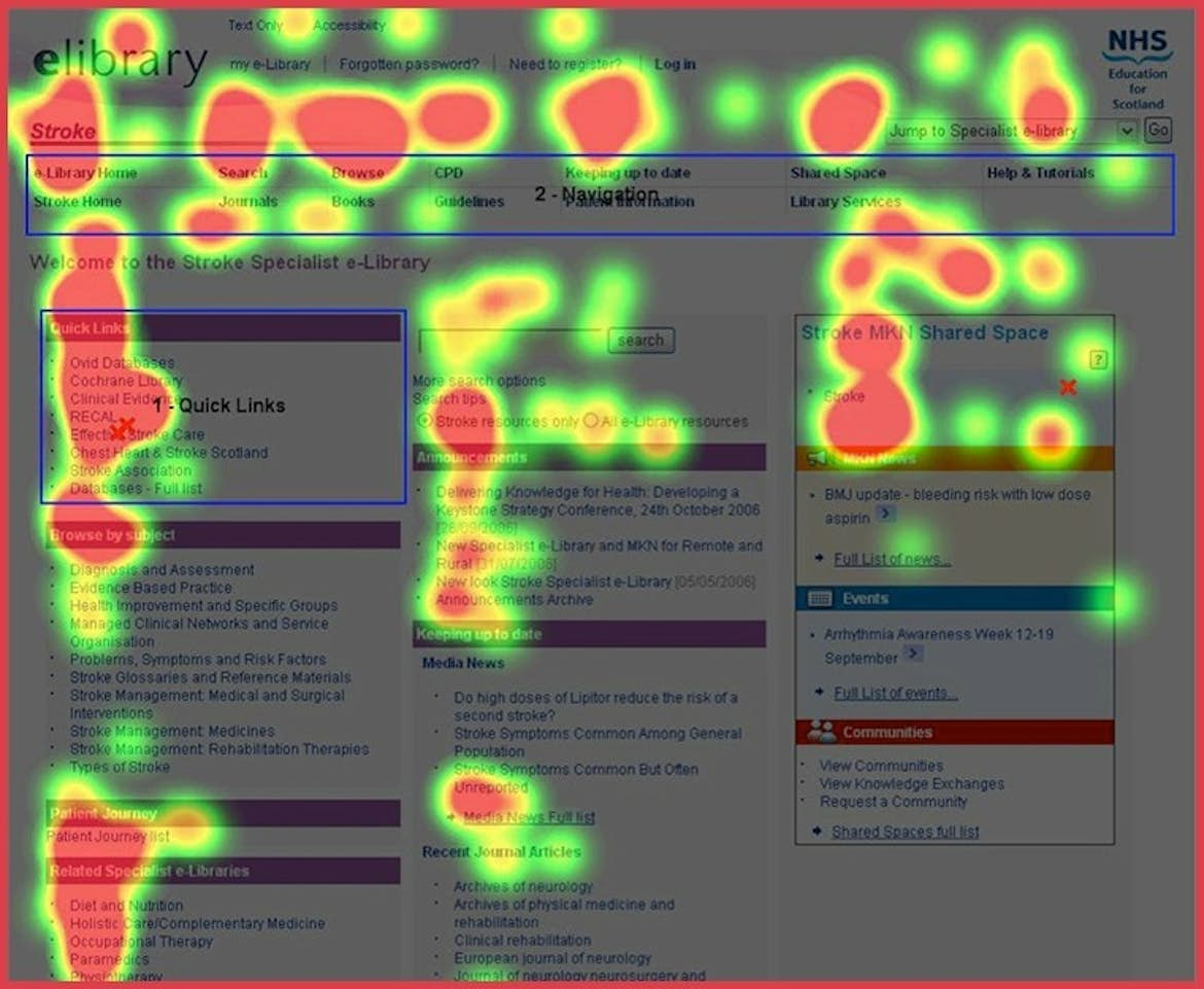
When designing or enhancing your website, you should position your most strategic messaging in the top left corner, which the user’s eye is naturally drawn to first. This coincides with research that users view websites in an F-shaped pattern, as illustrated in the heat map below.

Brain Power
Outside of the emotional connection behind cognitive design is the underlying thought process. Website design principles such as usability, navigation, readability and accessibility can make or break the customer experience. If users don’t immediately connect with what they’re seeing, they won’t stay long enough to discover your brand.
Luckily, there are a number of steps in the user journey before the consumer decides if and when to make a purchase, for example, which makes designing your site and user interface so critical.
Factors include:
- Navigation: keep your primary navigation bar simple and uncluttered
- Search tool: make it easy to find and personalize results
- Color scheme: choose bold and contrasting colors to increase attention span
- Balance/symmetry: provide a sense of order and stability
- Rich content: use high-quality content with visuals to enhance messaging
- Professionalism: show your competency and credibility
Speaking of professionalism, grammatical errors are a big no-no. How many times have you come across a website with a misspelled word and stuck around to see if there are…more misspelled words? Or maybe you click on a link that gives you the 404 treatment. It’s more than a little sloppy, which definitely takes away from what could have been a satisfying experience.
Take a Load Off

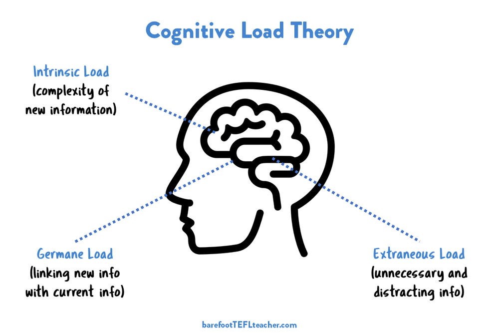
According to the cognitive load theory, our ability to make clear decisions when overstimulated by multiple impressions is compromised. The more accessible your site, the more appealing it is to consumers. Clean content, clean navigation and clear messaging can more effectively draw in your users.
There are three types of cognitive load: intrinsic, which refers to the inherent difficulty of a specific topic; extraneous, or the way the information is presented; and germane, the way someone uses their memory and intelligence to create mental schemas or processes.
A solid user experience should minimize cognitive load as much as possible so as not to overwhelm potential buyers. For example, Hick’s Law, otherwise known as “choice paralysis,” found that when a user is given too many choices, the longer it takes them to make a decision. Or they just become too frustrated to stick around.
Not Just a Pretty Interface
The Golden Ratio is one method for designing your website in a visually compelling way. It’s based on the so-called Fibonacci Sequence, a mathematical formula that dictates certain dimensions for the design. (And you thought you’d never use geometry again.) Research has shown that when something is appealing to the human eye, the brain scans those images more rapidly, reducing those dreaded bounce rates.
Below is an example of a clean and orderly website that adheres to the Golden Ratio.


The Story Behind the Story
An intrinsic component enmeshed in the psychology of web design is storytelling—who you are and what you stand for. You may wonder how mere words can fit into a solid design strategy but at the heart of its psychology is a relatable storyline, whether through images, videos, social media or even your company blog.
A well-told story generates empathy with your brand, triggering an emotional connection with your audience. A compelling narrative increases oxytocin, aka the happiness hormone, which is then associated with your brand, thereby increasing brand awareness and loyalty.
Use the Force

When choosing images on your website, make sure you use faces in your photos. The brain is hard-wired to respond to visual content. According to a study from iScribblers, people only remember 20% of what they hear—but 80% of what they see.
People also like to see other people in images; in particular, we respond and pay attention to faces. However try not to use generic stock photos that you end up seeing on every other homepage. (Looking at you, Pixabay.)
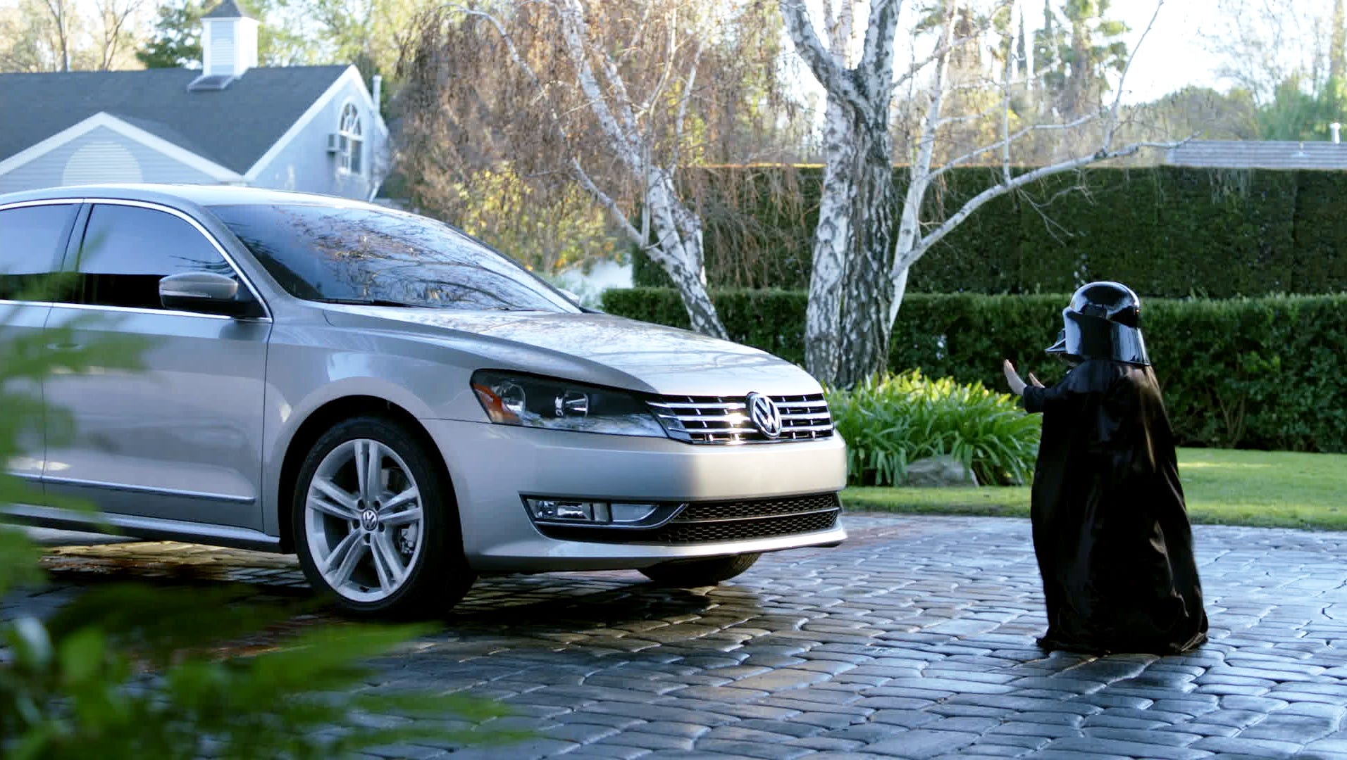
Videos can trigger even more of an emotional connection than images. In fact, it’s been shown that viewers remember 95% of your brand’s messaging when it’s in a video as opposed to simple text. They also have a better chance of going viral.
For example, you may still remember these iconic brand campaigns, even by name: When I Grow Up from Monster.com (2008); Lost Dog from Budweiser (2015); The Force from Volkswagen (2011).
Similarly, you can tug at your audience’s heart strings, make them laugh but, most importantly, make them remember you.
True Colors


One of the first things a visitor will notice about your website is the color scheme, even subconsciously. Aside from just seeing the color, the brain can help memorize and digest certain information through increased attention span. The colors you choose for your website say a great deal about your brand.
Numerous studies have found that color can account for up to 85% of why people purchase from your brand, and can help us memorize certain information. Many web designers employ the HSB system, short for hue-saturation-brightness, in order to choose colors in a personal way, culminating in a more authentic user experience.
The Psychology of Web Design
All that said, the cognitive and psychological impacts on the nuances of web design can’t be overstated. Brands that connect with their audience on an emotional level will more easily earn their trust and loyalty. In the end, innovative web design is a true art—one that will pull people in, and keep them there.
Feature image by Fakurian Design on Unsplash