

Contact forms are an essential but frequently overlooked aspect of website design. These forms can bridge the gap between your business and its customers. However, if they are uninviting and overly complex, your visitors might not use them. Thankfully, you can employ some simple techniques to create an eye-catching contact form that converts.
In this article, we’ll unpack the importance of contact forms and their role in shaping the user experience. Then, we’ll discuss six practical tips for creating engaging, user-friendly forms. Let’s dive right in!
An Introduction to Contact Forms
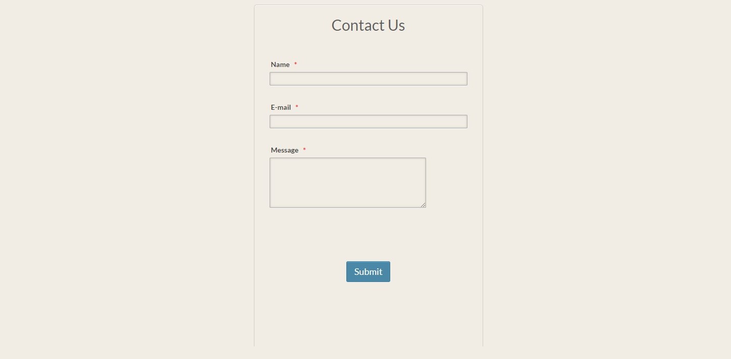
Contact forms enable online users to get in touch with businesses. They contain input fields that gather essential customer information such as names, contact info, and a message field (for comments, questions, or requests):


High-quality contact forms serve two vital functions: they help generate leads and act as a direct, organized communication channel. Unfortunately, many sites overlook the importance of this design element, creating uninspired forms that don’t support user engagement and conversion rates.
According to Zuko, there’s a lot of room for improvement when it comes to contact form design. Shockingly, only 38% of users interacting with contact forms successfully submit their details.
The view-to-completion rate is even lower, resulting in a final conversion rate of only 9%! These statistics are a stark reminder to business owners and web designers that only the best contact forms will be effective.
How to Design Engaging Contact Forms (6 Tips)
Creating engaging contact forms that convert doesn’t have to be intimidating. Here are six practical tips to help you design contact forms that stand out.
1. Keep It Simple
For starters, it’s best to keep your contact forms simple. This makes things easier for users, and can help prevent them from abandoning the form.
The most effective way to do this is by limiting the number of fields in your form. It’s best to only ask for essential information. This will also allow you to use a straightforward, single-column layout, which further enhances usability:
Contact form plugins like WPForms make it super easy to build simple forms. These plugins will help you create user-friendly interfaces and customizable templates.
If you can, it’s also a good idea to run A/B tests with different form layouts and fields. This will help you identify what resonates with your audience.
2. Reinforce Your Brand
A contact form should also align with your brand. Primarily, this helps support recognizability. Plus, brand coherence can help build credibility and support a seamless user experience.
Therefore, you’ll want to incorporate your brand’s colors, fonts, and logo into your contact form. You can even go a step further by reflecting your brand’s tone of voice in your instructions and messages:

Ultimately, adding these elements strengthens your contact form as a user-brand touchpoint. It should mirror your company’s narrative and values, fostering a consistent and engaging user experience.
3. Use reCAPTCHA
Contact forms, like email accounts, are susceptible to irrelevant or even malicious spambots. The resulting spam can clutter your inbox, hindering your ability to respond to your customers.
CAPTCHAs—tests that distinguish humans from bots—are standard solutions. However, they can interfere with the user experience and accessibility, especially for those with visual or cognitive impairments.
That’s where reCAPTCHA comes into play:

Unlike traditional CAPTCHAs that require users to decipher distorted text, reCAPTCHA asks users to identify objects in images or to simply check a box that says, “I’m not a robot.”
In fact, the latest version of reCAPTCHA (v3) operates invisibly in the background, so your users won’t have to hassle with this process at all. So, if you want to make your life easier, consider implementing reCAPTCHA.
4. Position Your Form Strategically
The position of your contact form can make or break its impact. Ideally, you’ll want to position your form “above the fold” (the part of a web page visible before scrolling). If you place your form “below the fold,” this may reduce the chances that people fill it out.
According to the Nielsen Norman Group, users view the 100 pixels just above the fold 102% more than the 100 pixels just below the fold.

Similarly, Google’s display advertising analysis demonstrated that ads just above the fold achieved 73% viewability, while ads just below the fold only reached 44% viewability.
The fold aside, it’s just as vital to avoid overcrowding your form page with ads or other distracting design elements. In short, place your contact form strategically and make it the center of attention.
5. Craft a Distinctive Call-To-Action (CTA)
A distinctive Call-To-Action (CTA) is crucial to the success of any contact form. As the name suggests, a CTA is a direct instruction that encourages visitors to act.
To craft compelling CTAs, follow these guidelines:
- Stand out from the crowd. Avoid boring “Submit” or simple “Send” buttons. Instead, use enticing phrases like “Get An Answer!”, “Ask Away!”, or “Get In Touch.”
- Use an attention-grabbing color. Select a color that contrasts with your site’s scheme to improve visibility. There’s no universal “best color,” but it should attract attention without disrupting your design.
- Perfect your placement. Remember the fold? Positioning your CTA “above the fold” can boost visibility.
- Size matters. Your CTA needs to be highly visible but not too aggressive, especially for mobile users.
These guidelines will help you create an effective CTA!
6. Provide Confirmation
Providing your users with a submission confirmation message is essential. This confirmation serves two purposes. First, it lets your customers know that you’ve received their information. Second, it helps to create a sense of closure and satisfaction.
After a user has submitted a form, redirect them to a confirmation page or display a pop-up message communicating their successful submission. This could be as simple as “Thank you! Your message has been received.”
However, you can also consider personalizing your message to align with your brand and voice:

If appropriate, let your users know what they can expect to happen next. For example, you might inform them that they’ll receive a response within a certain timeframe.
If it aligns with your business model, you could also use this opportunity to offer your customers a discount or some other incentive for their next visit. By providing confirmation, you’re improving the user experience and paving the way for future engagement with your business.
Conclusion
Designing an engaging contact form is all about balancing usability with branding. Keeping it simple, using a distinctive CTA, and strategic placement are just some of the strategies you can employ to design a form that captivates and converts.
Do you have any questions about how to design an engaging contact form? Let us know in the comments section below!
Image credit: Unsplash