


A menu that’s difficult to navigate can lead to a poor user experience and a drop in sales. By using the right type of navigation menus, you can make it easier for users to find the products they want, and potentially increase your conversion rate!
In this article, we’ll discuss the real impact that navigation can have on a website. Then, we’ll look at three types of navigation menus you can use on your e-commerce site. Let’s get to it!
The Benefits of Good Site Navigation
A well-designed navigation menu can significantly enhance the User Experience (UX) on your website. This is essential for an online store as it enables users to complete a purchase without any hurdles:

If a user is unable to find the page or product that they’re interested in, they’ll probably get frustrated and leave your site. Therefore, your menu should be visible, accessible, and easy to use.
There are a lot of ways to enhance a site’s UX, from minimalist layouts to seamless checkouts and fast loading times. However, menus are particularly important because they’re the main way in which users move through a website.
A user-friendly navigation will also help you improve your website’s structure. For example, it enables you to organize products or services into distinct categories, create links between relevant pages, and more. This is important for your site’s Search Engine Optimization (SEO) because it helps search engines crawl and index your pages more efficiently.
3 Types of Navigation Menus for Your E-Commerce Site
You’re probably already familiar with some types of menus, at least visually. However, it’s important to understand when to use them on your site.
So, let’s look at three effective navigation menus for online stores.
1. Horizontal Menus
This is possibly the most widely used menu in website design. It usually consists of a series of tabs or buttons placed horizontally across the top of the page, just below the site’s header:
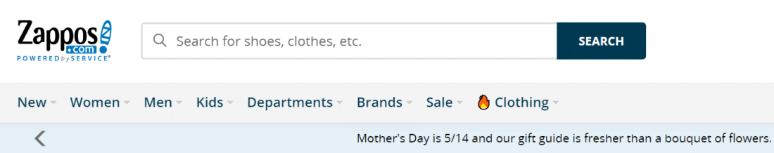
When a user hovers over an item, they may get a dropdown menu with subitems. For instance, if they navigate to the Women category, they may see items like Dresses, Shoes, and Accessories.
Benefits of horizontal menus:
- They’re easy to use and understand, so they’re ideal for sites with a simple structure.
- They provide a consistent navigation experience across different devices.
- They take up minimal vertical space, leaving more room for your content.
When to use horizontal menus:
- Your site has a limited number of main categories
- You want a clean, minimalist design that doesn’t distract from your content
- If you want to make sure the menu is visible on desktop and mobile devices without requiring additional user interaction
Horizontal menus are very straightforward. Plus, since they’re very common, most internet users already know how they work.
The one situation where we caution against using horizontal menus is if you run an e-commerce site with too many categories. Some e-commerce sites do this, but users may find these complex menus a little overwhelming.
2. Hamburger Menus
The hamburger menu, also known as the “three-line menu,” is a compact and versatile navigation menu that’s very popular in responsive sites:
It’s typically made up of three horizontal lines which, when clicked or tapped, expand to reveal a dropdown or slide-out menu containing the site’s main navigation links:
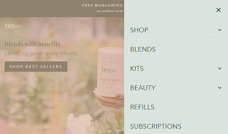
Since the menu occupies little space, it’s perfect for navigating online stores on a mobile device.
Benefits of hamburger menus:
- They help save space on smaller screens, providing a more content-focused experience.
- These menus provide a familiar and consistent user experience for mobile users.
- They can be easily customized to match your site’s design and branding.
When to use hamburger menus:
- You want to prioritize content on mobile devices by hiding the menu until it’s needed
- Your site has a large number of main categories that would clutter a horizontal menu
- If you want to create a consistent navigation experience across devices, regardless of screen size
Hamburger menus can be particularly useful if most of your traffic comes from mobile devices.
However, keep in mind that you can have different menu structures for responsive websites. For example, your online store can have a horizontal menu for desktop devices and a hamburger layout for smaller devices.
3. Sticky Navigation Menus
A sticky navigation menu, also known as a fixed or persistent menu, remains visible at the top or side of the page as the user scrolls down. This ensures that the main navigation options are always accessible, even on long pages with lots of content:
You can have sticky top or bottom navigation menus. However, this type of menu usually gets placed at the top of the screen.
Benefits of sticky navigation menus:
- They can improve the overall user experience by providing constant access to the main navigation options.
- Sticky menus encourage users to explore more of your site by making it easy to switch between sections.
- They can be easily combined with other menu types, such as a horizontal or hamburger menu, for added versatility.
When to use sticky navigation menus:
- You have a content-heavy site where users will likely need to navigate between sections frequently
- You want to ensure that the main navigation options are always visible and accessible
- If you want to improve the user experience by minimizing the need to scroll back to the top of the page to access the menu
Sticky navigation menus are incredibly useful for online stores with a lot of pages. They can save users time as they won’t need to return to the top of each page to continue their journey.
The main caveat with this type of menu is that it shouldn’t use too much space. Otherwise, it could make your page seem small and crowded.
Conclusion
Menus play an essential role in the customer journey, so you’ll want to use them effectively. For example, a hamburger menu is ideal for sites that get a lot of mobile traffic. Meanwhile, sticky menus help improve the user experience by eliminating the need to scroll back and forth across the page.
Do you have any questions about navigation menus for e-commerce sites? Let us know in the comments section below!
Photo by mark chaves
Join the conversation