A lot needs to be done about really slimming down websites and slimming down content to make them ultra specific to that targeted audience.
Shaan Nicol is Founder and CEO of Chillybin WordPress Web Design. Chillybin is one of the most well known full-service WordPress web design and development agencies specializing in e-commerce website development.
Nicol is an experienced web designer and WordPress developer. He’s also an organizer of WordPress meet-ups and lead organizer of WordCamp Singapore. A New Zealand native, he has been building websites for over 20 years.
In this episode of Velocitize Talks, Nicol shares his thoughts on WordPress, web design and development, target audience, lead gen and user-centric design.
Balancing Web Design & Lead Gen (2:19)
When someone comes to your website, nine times out of ten they’ll probably have five or six of your competitors open in different tabs at the same time. It’s about differentiating yourself against the competition and making sure that the user can see themselves in that journey.
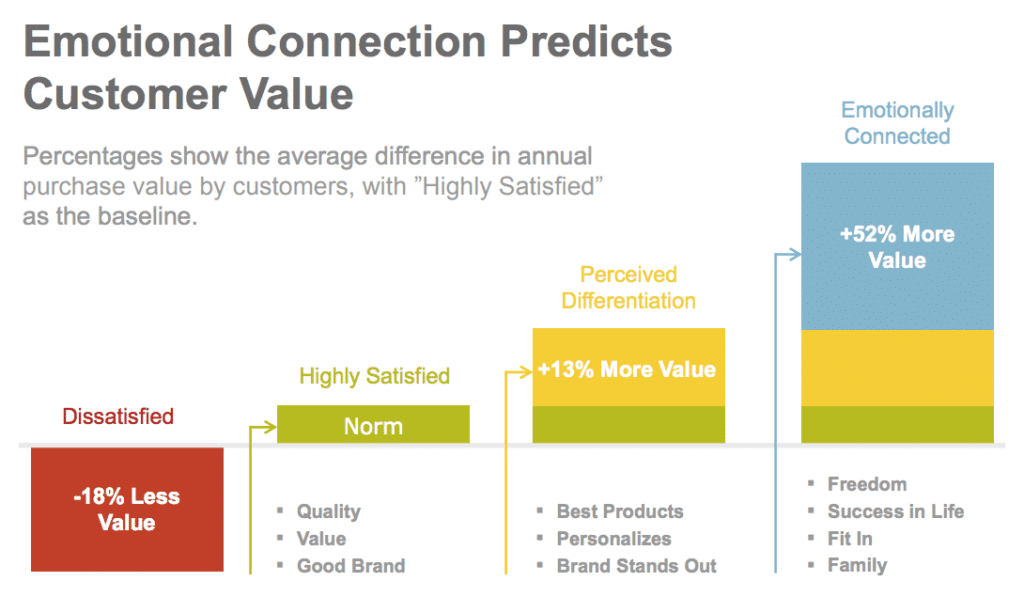
Chillybin is in the business of creating engaging and attractive websites; at the same time, they also need to increase lead gen and boost revenue for their clients. A compelling web design lends itself to an improved user experience which in turn leads to increased conversions.
“Purposeful user flow is essentially a journey that the user will take from point A to point B to point C,” Nicol says. “We try and effectively manage that as best as we can.”
When seen through the lens of the customer, the experience naturally becomes more defined. Likewise, according to Nicol, users need to be able to envision and immerse themselves in the customer experience to connect with the brand.
One way to do this is by featuring positive case studies, customer testimonials, and blog posts on your website. This can increase credibility in the eyes of your consumers while showing them effective solutions.
Stay on Target (3:43)
Who are you, what problems are you solving, and how can you do that effectively?
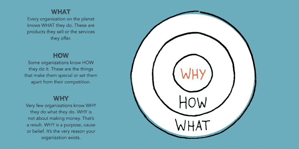
User-centric design is especially critical for a company’s homepage and its About page. These are typically the first impressions a visitor makes about your brand. That initial design needs to draw in consumers to ultimately lead them to specific product pages and throughout the website. Eventually, there should be some type of contact form and an accompanying call to action.
“Users are really presented with all the right information at the right time,” Nicol says. Human-centered design which informs the user experience helps drive creative solutions to consumer issues while attracting quality leads.
Investor Relations (5:38)
A lot needs to be done about slimming down websites and slimming down content to make them ultra-specific to that targeted audience. The best bang for your buck and the best objectives are niching down and working out that audience.

According to Nicol, the first place to invest your marketing dollars and resources today is in identifying and cultivating your target audience and then, eventually, your secondary markets. This investment into understanding your audience on a deeper level can help accelerate the overall digital presence. In other words, the user experience informs the user interface, and vice versa.
“It’s easy enough to grab a template, put your content into that template and have a website,” says Nicol. “Is that website going to be effective? It doesn’t actually speak to anyone. It fulfills the business objective of having a website but doesn’t fulfill any marketing objectives.”
The Beauty of WordPress (7:01)
We haven’t found anything that we haven’t been able to do using WordPress.

Chillybin has used WordPress predominantly for the past 15 years across many different iterations such as Gutenberg, Genesis and headless architecture. According to their website, some of their clients continue to rely on Chillybin for WordPress support going on 10 years.
An example of one of Chillybin’s clients leveraging WordPress in an innovative and exciting way is the financial organization Fullerton Fund. Fullerton already had a corporate website but it needed a revamp to meet the needs of its highly educated and sophisticated audience, including high net-worth clients and savvy investors.
In its web design for Fullerton, Chillybin followed a purposeful user flow pattern that began at the homepage, moved through investment views, and ultimately presented a CTA/contact form. Chillybin developed the website with WordPress Multisite which vastly improved navigation, content structure, and overall design.
What Inspires Shaan Nicol? (10:03)
What really excites me in terms of my client work is solving problems. A lot of times people don’t necessarily know what the problem is at the start so we spend a lot of time digging into that and working out what the problem is and what the solution would be.
To learn more about Chillybin, visit their website and follow them on LinkedIn, Facebook and Twitter at @chillybindesign. To keep up with Shaan Nicol, follow him on LinkedIn.




Join the conversation